Make website design easier by knowing these common web design terms
If you work in tech, own your own business, or if you’ve ever created your own website, app, or print materials, you likely know a little bit about how to work with a web page designer. It can be daunting to enter a web page design meeting for the first time with little idea of what to expect or what you need.
A few of our own designers at 729 Solutions shared the things they wish every client knew before their first meeting about web design services. Below are all the web design definitions you should keep in mind in order to be informed as you prepare to work with a web designer.
Here are fifteen web design definitions we think you should know:
Mock-up
A mock-up is a scale model of a web page design meant for design evaluation before you begin to physically build something out.
Wireframe
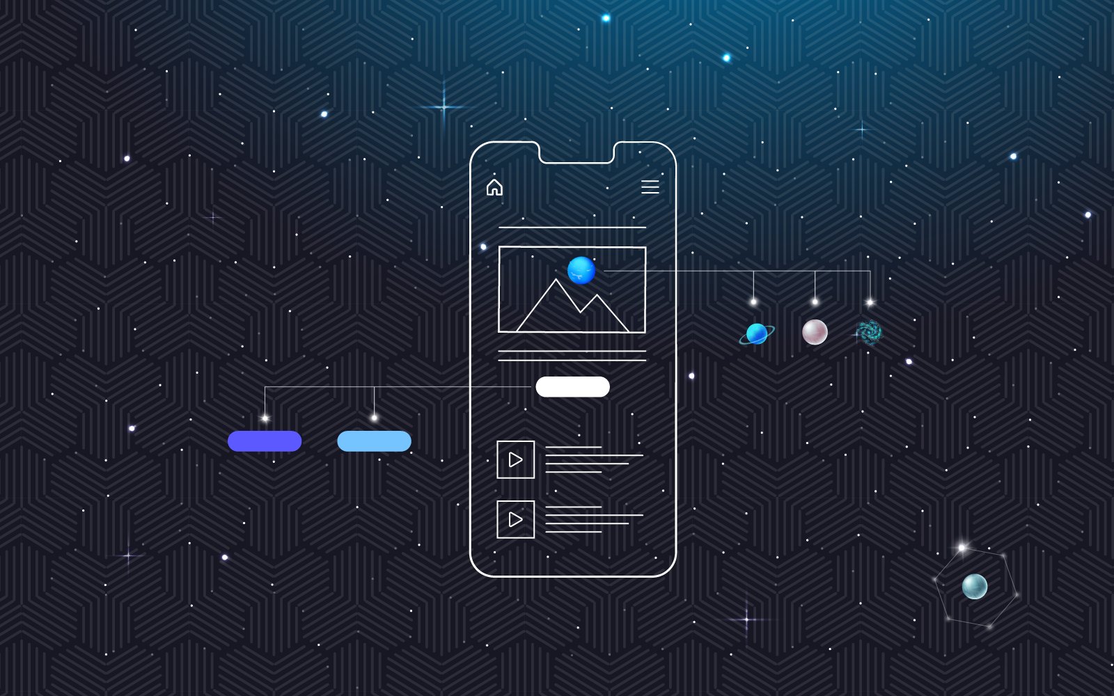
A wireframe is the very first preview of the web page design, and it comes before the mock-up or the comp. It consists of the skeletal framework of a website and is usually low fidelity, only meant to help ensure clients’ and designers’ thinking is aligned when designing the overall website.
Style Guide/Style Sheet
A style guide (or style sheet) establishes standard style requirements to ensure consistency within a document or across all aspects of a business. It typically includes things like fonts, colors, logo use, image style, and icons.
Copy
Copy refers to text or branded written material that might be included in a web page’s design.
RGB vs. CMYK
There are two different color systems, or palettes, of color, used when working with web page designers, depending on the scenario. First, there’s red, green, and blue (RGB). All of these colors start black and then become lighter as layers are added. Then there’s cyan, magenta, yellow, and black (CMYK) that start as bright colors and are reduced to black with each layer. Web page designers typically use RGB while printers use CMYK. Our designer Bob wrote a great blog post about why it’s important to understand the difference.
Deep Empathy
Deep empathy is design that is used to connect with a user on more than just a visual level.
Responsive
Responsive refers to the way a website displays on different devices. For instance, a cell phone’s pixel dimensions are different than those of a tablet, which are different from those of a desktop. When creating a website, a web page designer is careful to ensure it is responsive on all platforms. Check out Bob’s blog post that goes in-depth about responsive design.
Flat Design
Sometimes, when working with web designers, you’ll be presented with an option for flat design. In this variety of web page design, you won’t see any dimensional depth on your page. Instead, the web designer focuses on simplicity and functionality. To compensate for the lack of depth, designers typically use bright colors, primitive shapes, and icons— the basics of graphics— to heighten the imagery.
Above the Fold
The fold is one of the most important web design definitions when working with web designers. The term originated with newspapers, where the newspaper is folded and above the fold would be visible at the top when the paper sat on a sales display. In terms of web design, the fold is the line where your screen ends. Anything that appears on your screen when you initially open the page is considered above the fold. Any content you must scroll down to view is considered below the fold. This space is considered prime real estate – where you display your most important information, as well as indicators that the user can scroll to read more.
White Space
Negative space, or white space, is the empty area between the design elements. When used wisely, this space can play an enormous role in overall user experience (UX) design while also delivering a clean and easy-to-read aesthetic.
Comps
Comps, or compositions, are visual representations or previews of how the finished web page design product will look so that all parties can sign off on the design where necessary. This is where decisions regarding color, typography, imagery, and interactions are made. The importance of user interface (UI) and UX design comes into play here as you merge the web page design with the rest of your brand messaging.
Hierarchy
Hierarchy is the principle that the visual arrangement of web page design elements signifies importance. For instance, you’ll naturally read a headline first because it appears in big, bold fonts at the top of a page while you read a caption later because it’s smaller, lighter in color and tucked beneath an image.
Color theory
Color theory is the study of how colors affect people on a psychological level. Colors and the user experience go hand in hand. There’s a lot of evidence to show that warmer hues such as red encourage active behavior while cooler hues like blue reduce stress, which is why many hospital walls are painted cool hues. Read our Front End Developer Mel’s blog post expanding on color theory.
Resolution
While the difference between high resolution and low resolution can mean the difference between a clear or foggy image, many people outside of the web page design world don’t understand what resolution is in computer terms. Your resolution setting is simply the number of pixels displayed on the screen horizontally and vertically. For example, a 1024 by 768 setting is 1024 pixels across and 768 pixels high. The more pixels in the image, the crisper it will be. Many devices use different resolutions. Bob goes in-depth about resolution in this blog post.
Rule of thirds
The rule of thirds is the principle that if you divide an image with two vertical and two horizontal lines, the areas where the lines meet will become focal points. The viewer’s eyes will naturally be drawn to this location.
With this basic understanding of design terms, you’ll be able to keep up in your next web design services meeting and maybe even impress your designer.
Simplify your web design process
You can spend a lot of time and money making your website look amazing and function in a way your users will respond to. That’s why it helps to have someone at your side who understands industry standards and can help you navigate the intricate world of web design.
Build the best website for your business by bringing aboard the expert team at 729 Solutions. Whether you need web design services from the ground up, or you simply want to amplify your reach and audience with a hyper-powered UI/UX strategy, we can help.
Send us some information about your particular needs. We’ll happily review your site and see how we can help.


