If you’ve spent any meaningful time inside Zendesk, you already know this: the product is powerful, flexible, and constantly evolving. And while that evolution is necessary, it also comes with a cost.
Change is hard.
Not in the abstract, philosophical sense. In the very real, “why did they move that button?” kind of way. The kind that interrupts muscle memory, slows you down for just long enough to be frustrating, and forces you to relearn workflows you’ve had dialed in for years.
But here’s the thing I’ve come to appreciate, especially working with customers day in and day out at 729 Solutions: every meaningful shift in Zendesk’s UI has been in service of something bigger. More scale. More clarity. More alignment across products that were once stitched together and are now truly unified.
To understand where we are today, it helps to go back.
The Before Times: Admin Settings in Support
There was a time when Zendesk Support was Zendesk.
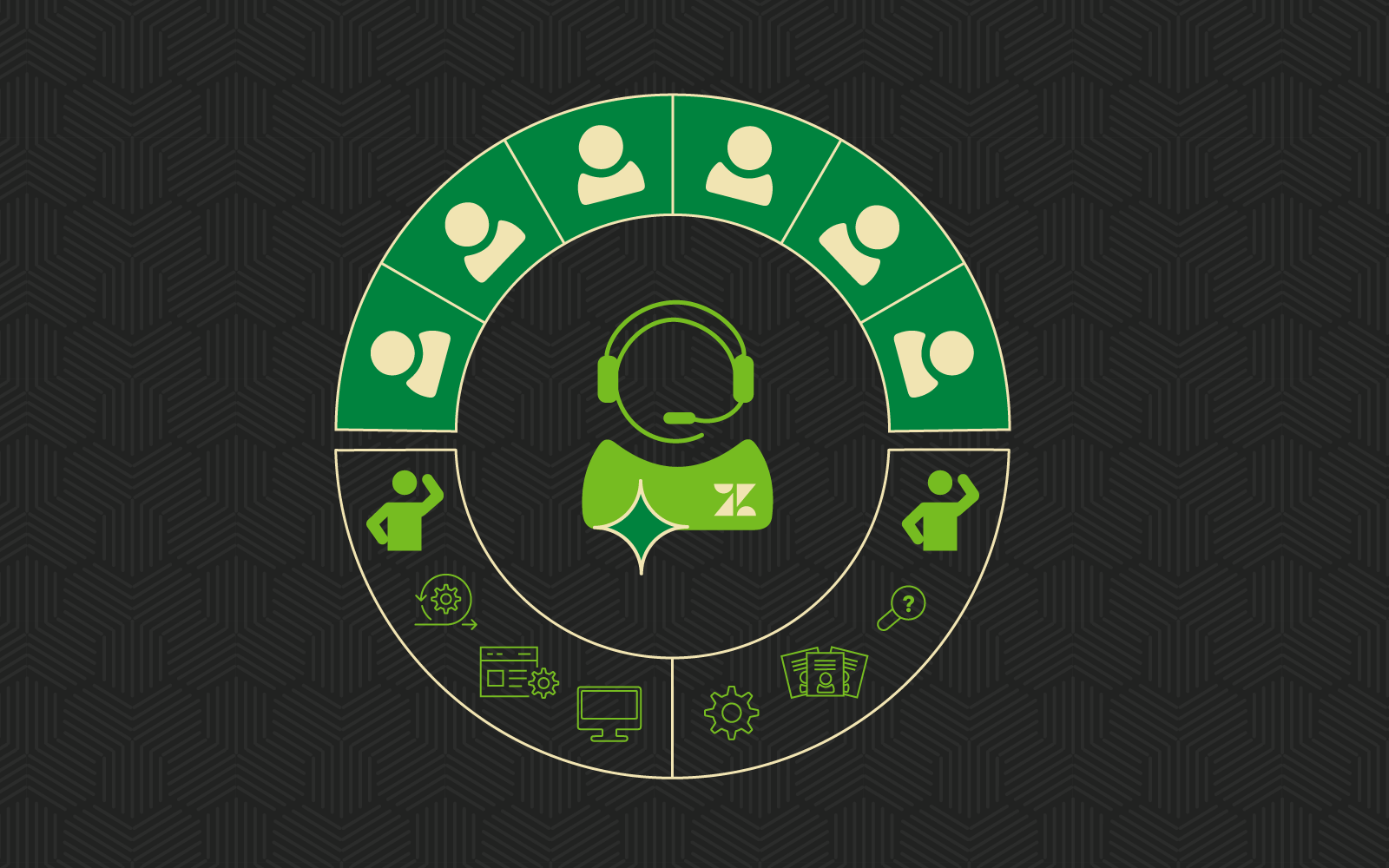
If you were around in those days, you probably remember the original Admin interface tucked neatly inside the Support product. Everything lived there. Triggers, automations, views, user fields, macros, SLAs. It was all accessible through a single pane of glass, but that pane was starting to crack under the weight of growth.
The navigation was… let’s call it functional. A left-hand rail that expanded into nested menus, each one revealing more configuration options than the last. It wasn’t always intuitive, but once you learned it, you really learned it. Power users could fly through configurations with speed that felt almost surgical.
But there was a catch.
Zendesk was no longer just Support. Guide, Chat, Talk, Explore, Sell, Sunshine, and later Messaging and AI capabilities were all evolving rapidly. And each product came with its own settings, its own logic, and sometimes its own entirely separate admin experience.
What started as a single, cohesive interface began to feel fragmented. Admins were context-switching constantly, and the mental model of “where does this live?” became increasingly complex.
It worked. Until it didn’t.
Enter the Admin Center (2022)
In 2022, Zendesk made one of its most significant UI and structural shifts with the introduction of the Admin Center. At first glance, this felt like a big move. Because it was.
Settings were no longer confined to the Support product. Instead, Zendesk created a centralized administrative hub designed to bring configuration across products into one consistent experience.
The Admin Center introduced clearer separation between agent workflows and admin configuration. It reorganized settings into logical groupings like Objects and rules, Channels, Users, and Apps and integrations. It also began to standardize how different products exposed their configuration, reducing the need to hunt across multiple interfaces.
For seasoned admins, this required an adjustment period. Muscle memory took a hit. Triggers weren’t where they used to be. User management felt different. Even the act of navigating between settings required a reset.
But once you settled in, something became clear. This was more scalable.
For organizations running multiple Zendesk products, the Admin Center reduced friction. It created a more unified mental model and set the stage for deeper cross-product functionality. It also made onboarding new admins easier, which is something anyone who has trained a team can appreciate.
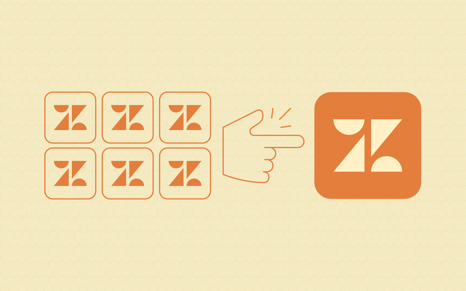
The Four Square Menu: A Small Icon with Big Implications
Around the same time, Zendesk introduced what many of us casually refer to as the “four square menu.” Officially, it’s the product picker. Practically, it’s the gateway to everything.
This simple icon represented a big step toward consistency. Instead of relying on browser tabs, bookmarks, or separate URLs, users could now jump between Support, Guide, Explore, Sell, and other products from a single, persistent control point.
The product picker reinforced the idea that Zendesk is a platform, not just a collection of tools. It created a shared navigation experience across products and helped users build a more cohesive understanding of how everything fits together.
From a usability standpoint, it also reduced friction. No more guessing which subdomain to hit or keeping a mental map of URLs. Just click the grid, pick your product, and go.
It’s one of those changes that quietly improves your day without demanding attention.
Unified Navigation: The Next Evolution
And now, we arrive at the latest chapter: Unified Navigation.
If the Admin Center was about centralizing configuration, Unified Navigation is about harmonizing the entire user experience across Zendesk products.
Historically, each Zendesk product had its own navigation paradigm. Even subtle differences in layout, labeling, and structure could create friction when moving between Support, Guide, and Explore. Over time, those inconsistencies added up.
Unified Navigation addresses this head-on.
A Consistent Left-Hand Experience
One of the most noticeable changes is the standardization of the left-hand navigation across products. Instead of each product feeling like its own island, there is now a shared structure that makes movement between tools feel seamless.
For agents and admins alike, this reduces cognitive load. You don’t have to relearn where things live every time you switch contexts. The layout feels familiar, even when the content changes.
Improved Information Architecture
Zendesk has taken a thoughtful approach to reorganizing menus and grouping related functionality. Items are labeled more clearly, and the hierarchy reflects how people actually use the platform rather than how it was historically built.
Good information architecture doesn’t just make things easier to find. It makes the product feel more intuitive, especially for new users. And for experienced users, it reduces the number of clicks and mental gymnastics required to get things done.
Cross-Product Fluidity
Unified Navigation also enhances how features connect across products. Whether you’re moving from a ticket in Support to related analytics in Explore, or from Guide content to messaging configurations, the transitions feel more natural.
This is where the long-term vision of Zendesk as a unified CX platform really starts to show.
Customization and Personalization
Another key element is the ability to tailor navigation to different roles. Not every user needs access to every feature, and Unified Navigation makes it easier to surface what matters most to each team.
For admins, this opens up new opportunities to streamline the experience for agents. Cleaner navigation means faster onboarding, fewer mistakes, and a more focused workflow.
Performance and Responsiveness
Behind the scenes, there are also improvements to performance. Navigation feels faster, more responsive, and more consistent across different parts of the platform.
It’s subtle, but it adds up over the course of a day.
So… Why Does This Matter?
Because UI is not just about aesthetics.
It’s about how people interact with the system. It’s about efficiency, clarity, and ultimately, the quality of the customer experience you can deliver.
Every second an agent spends searching for the right button is a second they’re not helping a customer. Every moment of confusion in the admin experience is a potential misconfiguration waiting to happen.Zendesk’s evolution in navigation and UI is about reducing those moments.
It’s about creating a system that scales with your organization, supports your team, and adapts to the increasingly complex world of customer experience.
Putting the You back in UI
So yes, change is hard. It disrupts patterns. It forces you to slow down before you can speed up again. And it can be frustrating, especially when you’ve mastered the old way of doing things.
But in my experience, these changes are rarely arbitrary. They’re part of a broader arc. One that moves from fragmented to unified, from functional to intuitive, and from isolated tools to a cohesive platform.
And if you want to see where that arc is heading next, there’s no better place than Zendesk Relate. I’ll be there. You should be too. Here’s why:
- The AI Roadmap: Get a front-row seat to the next generation of Zendesk AI and see how it will transform your workflow.
- Hands-on Strategy: Meet with experts (like us!) to learn how to optimize your setup for the unified interface and beyond.
- The Community: Connect with thousands of CX leaders who are navigating the same changes, challenges, and triumphs as you.
The legacy interface served us well, but the future of CX is being built right now. Don’t just read about the updates, come experience them live.
Register for Zendesk Relate 2026 today!
Don’t Navigate Zendesk Alone
If you need help with Zendesk including transitioning to the unified navigation, reach out to us! As an Authorized Zendesk Implementation Partner, we’re here to make sure your team doesn’t just adapt, but thrives, in the Zendesk platform.