27 UI/UX Design Principles and Best Practices 2021

Eat design goes a long way: a guide to UI/UX best practices

A List of the Top Best Practices for UI/UX Design From 729 Solutions

Great design goes a long way. The experience visitors have with your website sets the stage for their relationship with your product, your company, and your brand. A coordinated UI/UX design will produce a website that is visually attractive as well as easy to navigate for your users.

So much of website design controls how your brand interacts with prospects and customers. But what if users find your site confusing and can’t find what they are looking for? Consider what happens if visitors don’t want to wait for a page to load on your site. What happens if they can’t locate a call to action such as a link to your contact form or button to download your content offer? Chances are they’ll bail, as the average user attention span is getting shorter and shorter.

User interface (UI) and user experience (UX) design can help you solve these problems. While each has a different focus, they can work together to create the most effective digital design. UI design is essentially concerned with graphics, page layout, and formatting layout while UX design centers around the way users interact with and move through a site. Whether you have a simple “brochure” site, a software-as-a-service platform, or an eCommerce website, using time tested and proven UI/UX design principles are an absolute must for optimizing your site.

In this article, we put together the top eight out of 27 UI/UX principles and best practices selected by our team of seasoned UI and UX design professionals. If you consistently put these into action, you’re sure to be miles ahead of the crowd with a platform that not only stands out visually but also maximizes your user’s experience

1

Keep it simple

People spend less than 15 seconds on a website. Keeping them focused on your brand’s message requires a design that is clear and simple. This can be achieved by following the “less is more” concept and avoiding a busy, cluttered design.

Users are more likely to find the key messaging on your website if they have less content to scroll through and fewer options to choose from. Minimizing the options on your site will increase the likelihood that readers will take the action your brand seeks, such as leading them through a sales conversion funnel. Imagine the best grocery store experience where everything along the way is exactly where you need it!

A simpler design also loads faster and reduces the bounce rate from your site.

Bonus points: this also boosts your site’s search engine optimization (SEO)!

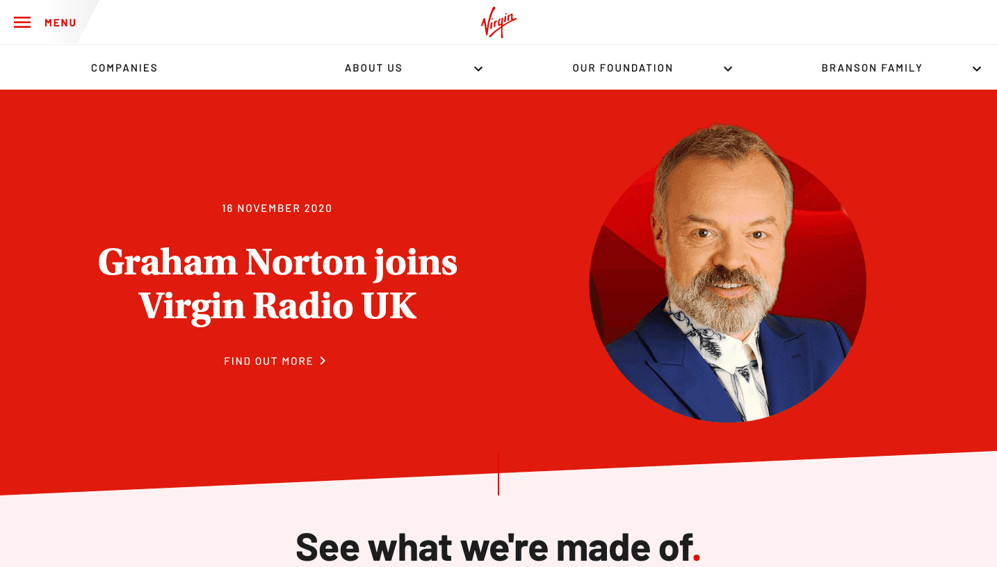
An excellent example of simple design is Virgin’s website, which gives you enough information to keep you interested without overloading you. Despite the fact that Virgin is a large conglomerate, the site presents the brand in a simple, clean way. Of particular interest is how the navigation is laser-focused down to four primary menu items in the header.

A perfect example of “less is more.”
1
2

Use consistency

Readers will find it easier to scroll through your site if you use consistency in your design. This applies to your colors, fonts, buttons, layout structure, photograph style, and more. The point is to make these design components familiar to your users, which helps make things more intuitive and predictable. And people do like predictability!

Predictability in UX can be defined as how much a user can successfully foresee the result of an interaction.

Beyond the internal consistency, website visitors also like to make connections with design conventions used across the web. The location of navigation buttons, the option to “read more” on content, and the use of autofill on a web form are all common design features across the digital landscape.

All of this consistency takes out the guesswork users may have when trying to interact with your website.

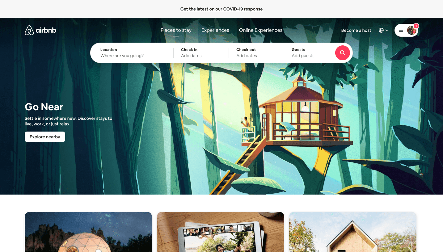
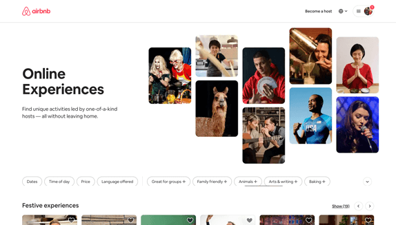
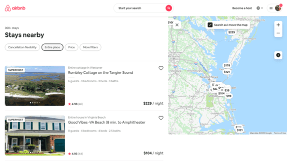
Airbnbdoes a fantastic job achieving consistency with the visual elements on its site.

The brand relies heavily on “cards” to create this uniformity: big cards, little ones, some in-betweens, simple cards, and more complicated ones. These cards can be sorted when you’re looking for experiences or places to stay, but ultimately you can expect a few consistent elements—a stunning photo, a title to capture your attention, and a variety of details deemed important at that phase of your journey.

1
1
1
3

Be Intentional

Choose the elements of your design with a purpose in mind. The colors, visual elements, and layout you select should all be intentional and not just because they look good.

Looks aren’t everything! Design is more about how something works than how it looks. It’s about both form and function.

Here are some guidelines for designing with intent:

  • Choose a color because it’s part of the brand identity guide or because it evokes the desired emotion.
  • Choose a font because it shows personality and allows the user to more easily read your content.
  • Choose a visual element that helps users accomplish a task on the site.
  • Choose a layout that showcases the most important parts of your design and that improves site navigation.

When in doubt, challenge the intent even when it may be uncomfortable. You may need to question why you want things done a certain way. By doing this, you can uncover the rationale behind design decisions.

One example of intentionality can be found in a visit to Koval’s website, a web production company. Upon arrival, the user is greeted with many distractions. While this goes against the ‘less is more’ philosophy that makes for a clean user experience, the company’s site experience fits its motto: “We create fast sites from which no one will escape.” True to form, as you scroll down the page and hover, things move, they change and you just might find yourself entranced.

Be honest. How long did the website capture your attention?

1
1
4

Set Expectations...

Along the lines of using consistency to create predictability, users also want their expectations for browsing your website to be met. They want to understand what will happen if they take an action on your platform. Tell users what the buttons on your website are intended to do. If the button will sign them up for your newsletter, add appropriate text on the button—“Sign Up Now” or “Join Our Email List”—that tells them exactly what will happen if they submit their email address.

Another feature readers will appreciate is an animated loading graphic. These “loaders” will let them know that the page is not frozen if there is a wait time while something loads.

Meeting your users’ expectations requires some design elements that may be obvious. For example, give commonly used names to the headers on the navigation menu. This will reduce any potential frustration readers may have while navigating and becoming familiar with a new platform.

5

...While Expecting The Unexpected

Don’t assume that everything will work out as you expected! There will always be exceptions to the rule. If you assume that your target audience is tech-savvy, for example, you’ll likely have someone in the crowd who is not. For users who are not digital natives, make sure the tabs and buttons on your site are clearly marked so that they can easily understand how to navigate through your site. Don’t abandon them to wander the proverbial halls in awkwardness – they’ll probably leave!

If you expect that everyone’s internet connection is fast, you won’t reach users who have low bandwidth and can’t download large images. To avoid this problem, avoid using complex graphics or custom typefaces that not all users will be able to access.

While your analytics may show that your visitors are primarily on desktop computers, don’t rule out the potential mobile device audience. Make sure your site is user-friendly on all devices and not just targeting a specific screen size.

Bonus points (again): Mobile-friendliness is a critical factor for good search engine optimization as well. In fact, most things that improve the user experience will also assist with your site’s SEO, including the next two items in our list.

6

A Hospitable Site Is Accessible And Inclusive

How will users who are colorblind or have a hearing impairment experience your site? Creating a website that is disability-friendly might not be something you “see” right from the start—unless you happen to be someone who needs to navigate the platform using accommodations.

Try using a screen reader, assistive touch, or a colorblind web page filter and you’ll have an entirely different perspective on whether your site is truly accessible. The first step in making your site available to all users is to determine whether your site’s design creates obstacles for users with disabilities.

Here are a few tips for providing an accessible site:

  • Choose black text on a white background instead of colored text.
  • Use subtitles on videos posted on the site.
  • Use descriptive alt tags on images so screen readers can describe them for the user.
  • Create larger buttons for people with fine motor skill difficulties (or those of us prone to “fat-finger” syndrome).

You can test your site’s accessibility at WebAccessibility.com to see where it ranks. After reviewing the results, make the recommended modifications to ensure your website can be used by anyone—no matter how they view it.

7

Use Responsive Design

Mobile usage has surpassed desktop usage and each year its share of online traffic rises. That’s why you need to use a responsive design on your site so that users can easily read and navigate it on any device.

A website design that isn’t mobile responsive may, for example, force users to enlarge the text on the screen to make it legible. Most often, readers who have to adjust the site on their cell phone to work around your non-responsive design will simply give up and leave your site.

Providing a responsive website doesn’t only enhance the user experience. In fact, Google awards higher rankings to sites that are mobile-friendly, which translates into higher traffic on your site. (There’s that SEO, again!) Responsive websites load more quickly, look great on every screen, and are easier to update.

It’s critical to make a positive first impression on users coming to your site from mobile devices. If you don’t, you might lose them to competitors’ more mobile-responsive sites.

AltaFoodcraft, a company that provides office coffee and refreshment services, has a fully responsive website. If you look at the site on a cellphone, the home page is easy to read and navigate because it has been optimized with a responsive design.

1
6
6
8

Plan For The Future

While building the website or mobile app that you need now, take into account that your site will likely change in the future. That is why you should create your site on a framework that’s flexible enough to allow you to adapt, change and expand as your business grows.

Choose your tools wisely so that you will not end up with a site with components that cannot be updated. A case in point: Adobe Flash was once a standard software platform that was used for the production of animation, apps, and mobile games. Yet Adobe has announced it will no longer update or maintain Flash after 2020, which means web developers will have to switch to alternate solutions if they haven’t already.

Another way to future proof your website is to monitor how your website performs. By using solid tracking and reporting from the start, you will have the data you need to guide future decisions.

Are You Ready For More?

Download our 27 UI/UX Design Best Practices PDF and reach out if we can help answer any of your questions.

Please enter a valid email.
Please complete this required field.

Our work

About 729 Solutions

729 is a team of hard-working designers, developers, project managers, and solutions architects. We are problem solvers who come up with new ways to make technology faster, safer, and easier. We are builders who create experiences and products that people love. We integrate complex systems in the simplest ways possible. We help fast-growing companies and their customers do more.

We’ve been engineering amazing technology for 15 years and we want to do it for you.

From The Blog