19 Brilliant Logo Designs
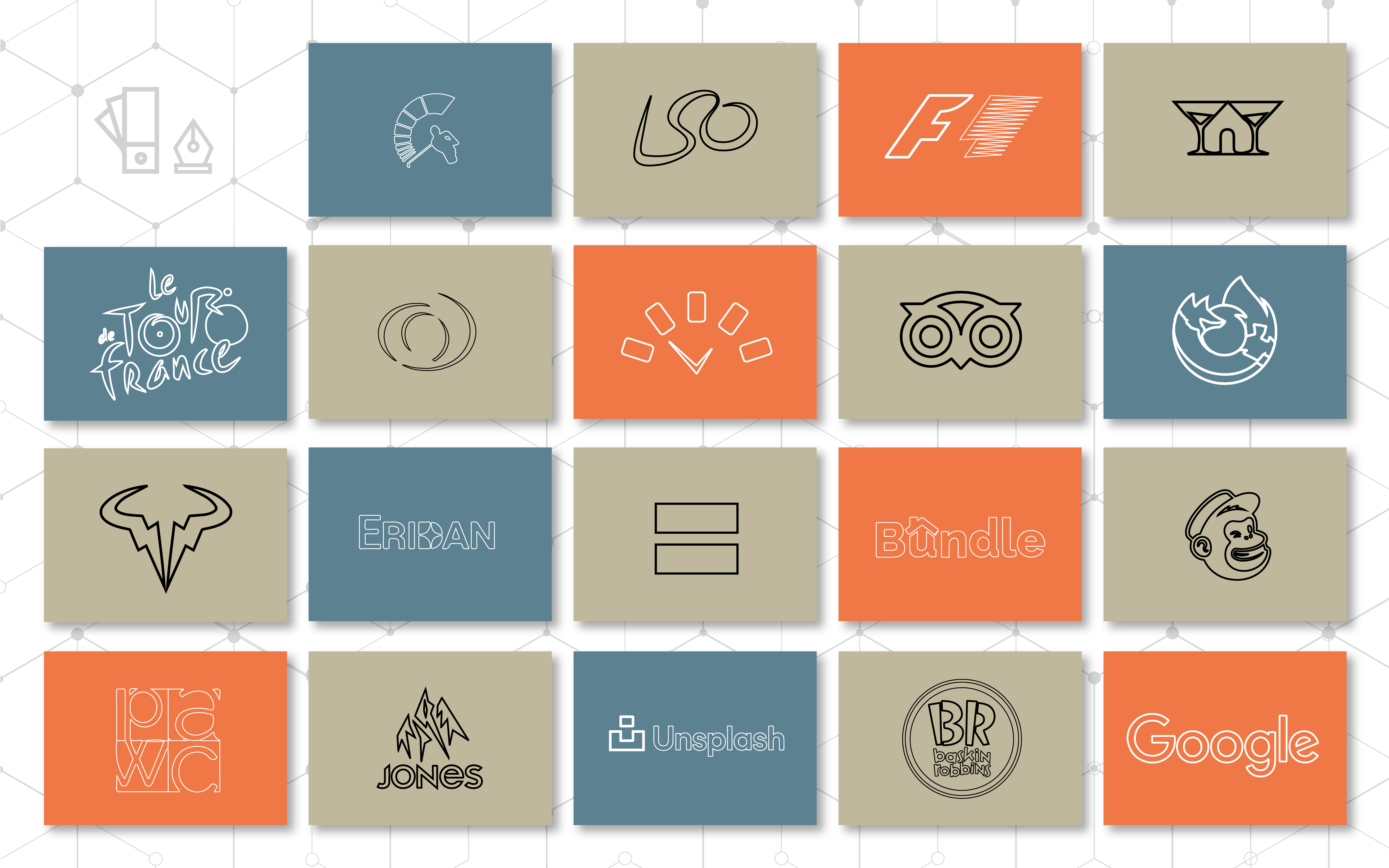
These logos portray some of the most brilliant designs to inspire your branding and marketing, using tactics ranging from hidden meanings to intentional symbolism.
What Makes Them Unique
1. Spartan Golf Club
This logo has hidden symbolism that’s both clever and effective. The golf club’s swing creates the spartan helmet, and the golfer’s body forms the spartan’s face. Designed by Richard Fonteneau, the creative double-meaning is what makes Golf Spartan remarkable.
3. Formula 1
This engaging design uses negative space to include the initials of Formula 1. The addition of the red spikes on the right side of the logo denotes speed and power, both fundamental qualities of the Formula 1 car racing company. Created by Carter Wong, F1 used this logo from 1993 through 2018.
4. Martini House
The Martini House logo shines in its relative simplicity. Its double meaning is almost immediately apparent to the eye, as the two martini glasses form a small house with a door. Designer Eddie Brown created this innovative logo for Martini House.
5. Le Tour de France
This logo for Le Tour de France is another example of a hidden message: if you look closely, you’ll see that the letter “r” in Tour doubles as a cyclist. The cyclist isn’t immediately obvious, making the hidden symbol discovery exciting for the viewer. Joel Guenoun is the creator behind this inventive logo.
6. Rome Symphony Orchestra
What makes this Rome Symphony Orchestra logo creative is the dual meaning portrayed within a straightforward design. While it’s not much more than two unfinished circles, it could represent either a conductor with their hands in the air or an audience member applauding. Its meaning is left open to the observer, which makes this logo smart yet uncomplicated.
7. TimeandDate.com
TimeandDate.com’s logo is simple, colorful, and packed with hidden symbols. The different colored blocks could represent the five weekdays, and the clock hands also form a checkmark, which is significant because the site allows users to check the time and date. Each block is also conveniently in the shape of a smartphone, which could be a nod to the website’s mobile app.
8. Trip Advisor
The Trip Advisor design illuminates themes critical to their mission: the owl (nicknamed “Ollie”) signifies wisdom and knowledge. Along with the wise owl connotation, the large eyes double as binoculars, which brings to mind travel and adventure. This brilliant logo was updated in 2020 by Mother Design, simplifying its colors to black and green as part of its rebranding campaign.
9. Mozilla Firefox
While many companies design their logos to hide double meanings, Mozilla’s Firefox logo is excellent because it’s downright obvious: it’s a fox with a fiery tail, wrapped around a globe. This logo is instantly recognizable, and its bold colors denote power and confidence. The logo has evolved to minimize the fox and increase the flames, but the color ]palette and overall design have remained the same since Jon Hicks created the logo in 2004.
10. Rafael Nadal
For people not familiar with Spanish tennis star Rafael Nadal, his logo might seem perplexing. However, this logo cleverly represents Nadal’s nickname: Raging Bull. On the court, Nadal is a force to be reckoned with, often grunting with intensity as he plays. This logo both depicts the bull’s head and also contains two mirrored lightning bolts to signify power.
11. Eridan Communications
The Eridan Communications logo has evolved, but one constant element has remained the same: the star within the “D” is a nod to the co-founders’ love of the celestial realm. The name Eridan comes from Eridanus, one of the largest constellations. The new design held onto the brand’s star motif, but 729 Solutions helped update their identity to reflect the cutting edge technology Eridan brings to the wireless communication market.
12. Human Rights Campaign
The Human Rights Campaign’s logo is an excellent example of simplicity and precise meaning. The foundation works to promote equality for all, and the equals sign in the logo perfectly portrays that message without being overly complicated. Stone Yamashita designed this clever logo for the HRC in 1995.
13. Bundle Loan
Bundle Loan’s logo design is an excellent combination of clarity and double meaning. Bundle helps customers secure home mortgages—the “u” in Bundle not only represents a house but also identifies the company’s goal to focus on “you,” the user. The graphic designer behind this great logo is 729.
14. Mailchimp
Sometimes the best logos have almost no hidden meaning at all: Mailchimp is the perfect example of this, opting instead to use an image that’s fun and recognizable—Freddie the chimp—rather than packing a new design with symbolism. The company recently went through a brand redesign, working with COLLINS to create a new logo with eye-catching colors and cleaner lines.
15. Psychiatric Alternatives & Wellness Center
This Psychiatric Alternatives logo is professional and clean. Using the initials helps remind the reader of the organization’s name, but the off-set and lowercase letters help add elements of uniqueness and personality to their brand. The designer behind this creative logo is 729.
16. Jones Snowboards
The Jones Snowboards logo idenotes founder Jeremy Jones’ ultimate playground: the mountains. The bold, sharp lines help portray power and adventure, and the overall shape of the logo is triangular, which in itself is indicative of a mountain peak.
17. Unsplash
Image database Unsplash has a smart logo that turned its original camera design into a pixelated version of a camera. Not only does the logo feature a “u” shape for Unsplash, but it also appears to be two puzzle pieces to help convey the idea that you can find the perfect image you need in their database. Mackey Saturday is the design company behind this clever logo design.
18. Baskin Robbins
The Baskin Robbins logo is an excellent example of hidden symbols: the “B” and “R” form a “31” for the ice cream company’s famous 31 flavors—a new taste for every day of the month. The pink-and-blue color scheme is playful and childlike, and the pink is a nod to the company’s iconic pink spoons that allow customers to sample any flavor.
19. Google
While the foundation of Google’s logo is rooted in primary colors blue, red, and yellow, there’s an intentional aberration in the standalone green “L” of the brand name. Designed by Ruth Kedar, the green expresses the brand’s trailblazing legacy and resistance to following the rules.
If these logos show us anything, it’s that we shouldn’t overlook the importance of a good logo. The best logo designs help brands quickly create memorable connections with the people they serve. So if you’re looking for inspiration and tips for your own brand’s logo design, take our advice. Don’t just slap something together, put some thought and purpose into it.
About 729 Solutions
Brand identity is a big deal to us because our own brand identity is what helps us connect to our customers. We design brands that speak in a crystal clear voice to your customers. Your brand identity is everything. Let’s make it unforgettable.
